Clarity Through Connection for a People-Focused IT Partner
Overview
QSS IT Solutions is a Somerset-based IT services provider supporting businesses with managed IT, communications, and cyber security. Known for their friendly, people-first approach and deep technical expertise, QSS had grown significantly—but their brand no longer reflected the clarity, confidence, or personality of the team behind it.
QSS IT Solutions partnered with Hatched Agency to refresh their brand, define a clear brand strategy, and deliver a flagship website that would better communicate the breadth of their services without overwhelming their audience with technical complexity.
Client
QSS IT SolutionsLocation
Somerset, UK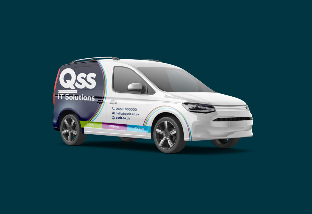
Solution
Brand Refresh & Strategy
Brand Audit & Discovery
Hatched Agency began with an in-depth discovery phase, working closely with the QSS team to understand their services, culture, audience, and ambitions. A key challenge identified was how to clearly communicate complex IT, cyber security, and communications services in a way that felt accessible, human, and engaging.
Three Pillar Brand Strategy
To bring clarity and structure to the QSS offering, Hatched developed a brand strategy built around three distinct service pillars:
- Tech – Lime
- Cyber – Cyan
- Comms – Purple
Each pillar was given its own clearly defined colour palette and visual language, allowing services to be easily identified while remaining part of a cohesive overall brand. This modular approach brought instant clarity across all touchpoints, from marketing materials to the website.
Brand Identity & Guidelines
Hatched refreshed the QSS visual identity and created comprehensive brand guidelines covering colour usage, typography, layouts, tone of voice, and application across digital and print. These guidelines ensured consistency and confidence as the brand was rolled out across multiple platforms.
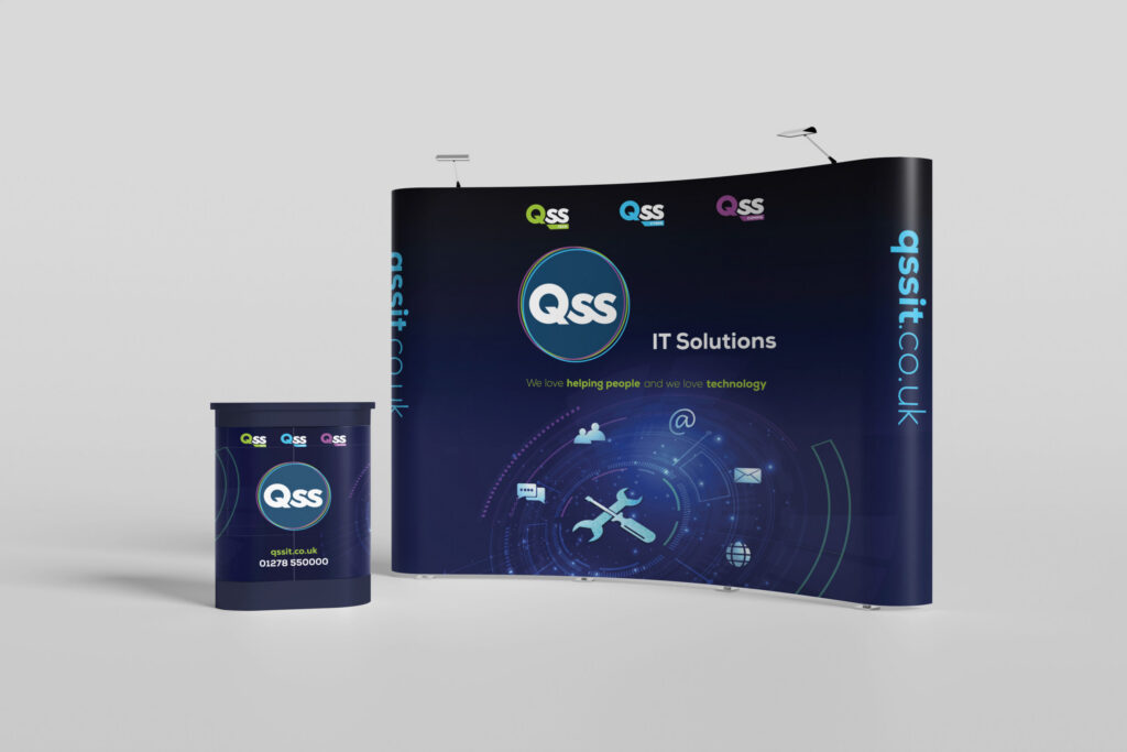
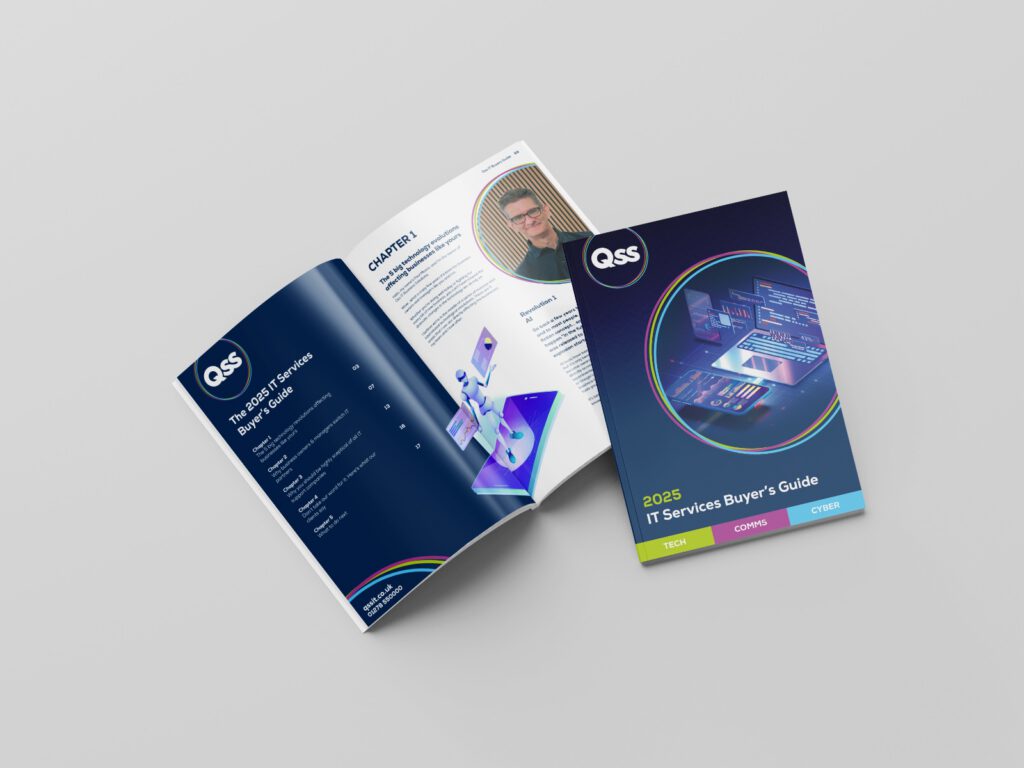
Brand Rollout
The refreshed brand was implemented across a wide range of assets, including:
- Stationery and internal documents
- Advertisements and marketing materials
- Social media graphics and templates
- Van livery
- Video content
This consistent rollout reinforced brand recognition and clearly communicated QSS’s three core service areas wherever the brand appeared.
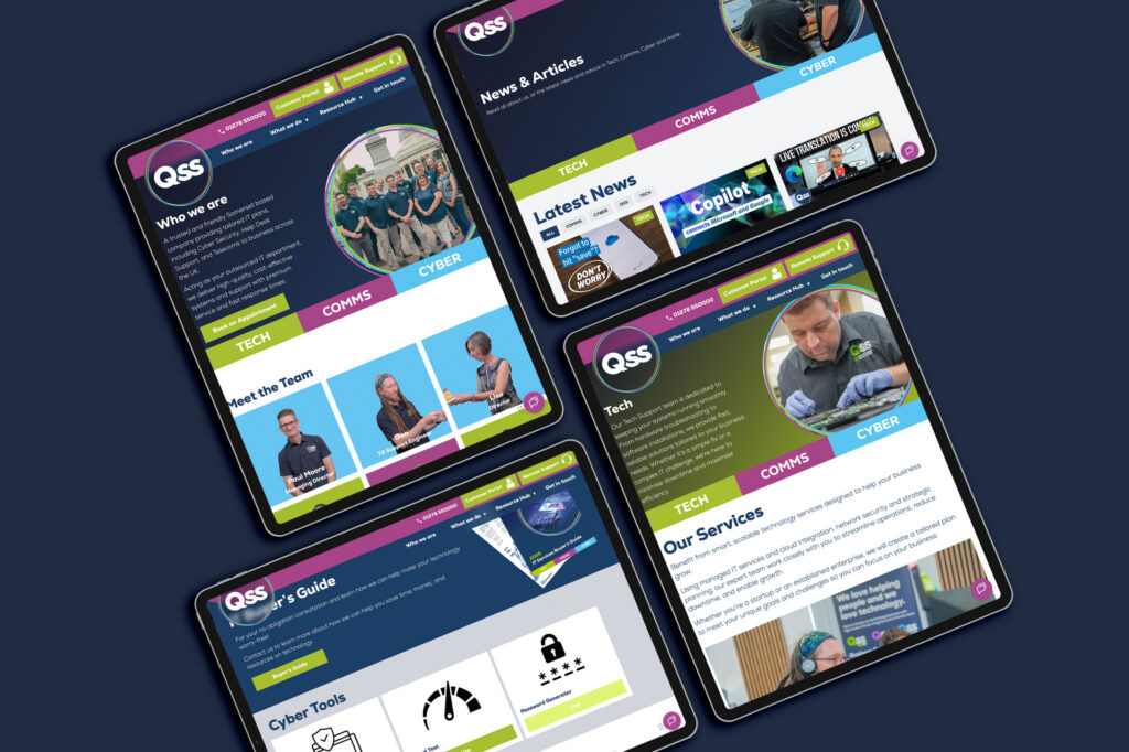
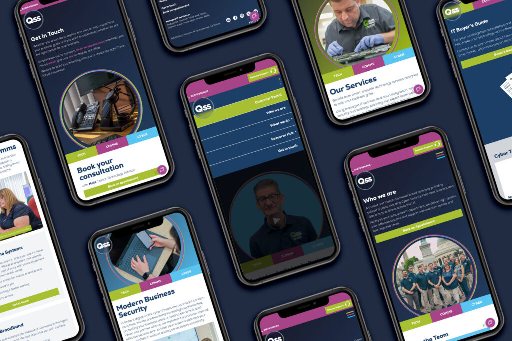
Website
User Experience & Structure
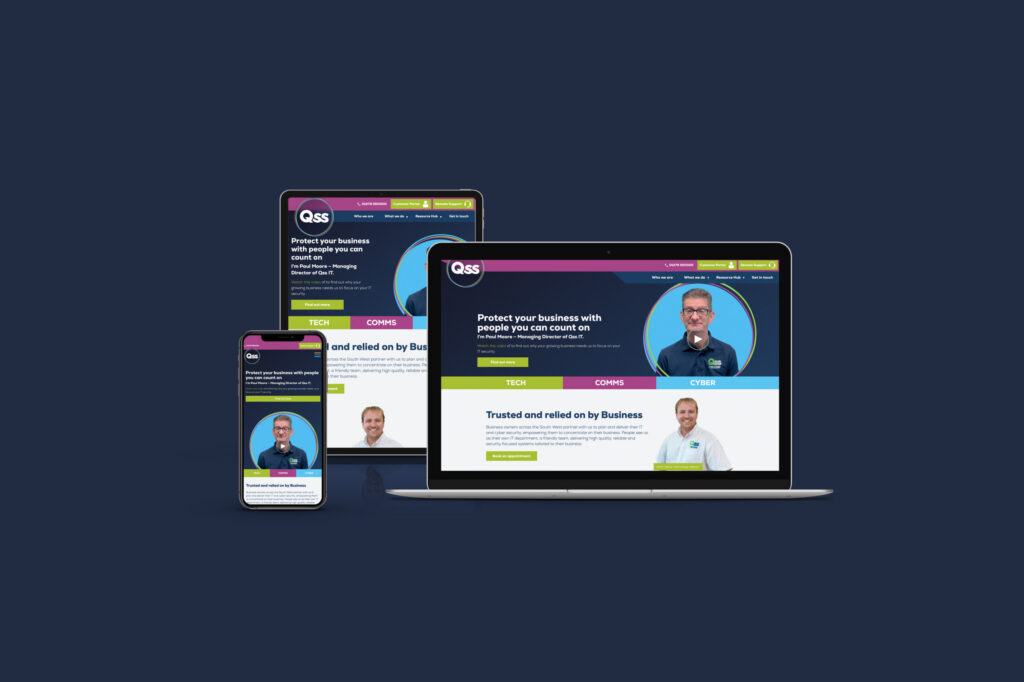
The new website was designed as the flagship expression of the refreshed brand. Hatched focused heavily on user experience, ensuring visitors could quickly understand what QSS does, how they do it, and which services are relevant to them—without unnecessary jargon.
Visual Design
The three brand pillars were brought to life throughout the site using their distinctive colours, helping users intuitively navigate between Tech, Cyber, and Comms. Clean layouts, confident typography, and engaging motion elements combined to create a modern, professional, and welcoming digital presence.
Interactive Team Page
To reflect QSS’s personable culture, Hatched created a bespoke interactive team page featuring a playful video concept of the team passing around a slice of cake—a recurring theme within QSS and a subtle nod to their collaborative, friendly ethos. This feature humanised the brand and reinforced that QSS is about people first, technology second.
Video Content
Bespoke video content was produced to support storytelling across the site, helping explain services visually while showcasing the personality and expertise of the QSS team.
Results
Hatched Agency delivered a cohesive, strategic brand refresh that transformed how QSS IT Solutions presents itself to the world. By introducing a clear three-pillar structure and applying it consistently across all touch-points, QSS now communicates its services with confidence, clarity, and character.
The new website brings together technical credibility and approachability, celebrating the people behind the business while clearly defining what QSS does and why it matters. The result is a brand and digital presence that truly reflects who QSS IT Solutions are and where they are heading.
Adam and Gavin at Hatched Agency have worked with QSS IT Solutions Ltd to recreate our brand, refine our image and help tell our story. Our dedicated and hard-working team are passionate about helping people with their IT and cyber security; yet trying to explain the breadth and complexity of what we offer, without becoming overly technical is a constant challenge. The creation of our three distinct business areas, Tech, Comms and Cyber, enabled the Hatched team to develop this clarity to deliver a slick, engaging and professional website. The final output was the result of a process where Hatched increased their understanding of what we were wanting to achieve. The fun, personable approach of our people, coupled with technical expertise, has been encapsulated in a creative and eye-catching manner, celebrating who we are and informing what we do. Thank you to Adam and Gavin for their collaborative approach, patience, and expertise in fulfilling the brief—a site we are all very proud of. I would highly recommend Hatched for their insight, talent, and commitment; I believe the website speaks for itself!