Challenge:
We started the project by conducting extensive research into the target audience, the honey market, and the competition. We conducted user research, including surveys and focus groups, to understand the needs and preferences of potential customers. We also analysed the branding and packaging of competitors to identify opportunities for differentiation.
Solution:
Brand Development:
Based on our research findings, we developed a brand strategy that focused on the natural and sustainable qualities of the honey. We created a brand name that was simple and memorable, as well as a tagline that communicated the purity and quality of the product.
Visual Identity:
We then developed a visual identity that reflected the brand strategy and resonated with the target audience. We created a logo that was clean and modern, with a minimalist design that emphasised the natural qualities of the honey.
We also created a style guide that included typography, color palettes, and imagery guidelines that would ensure consistency across all marketing materials.
Packaging Design:
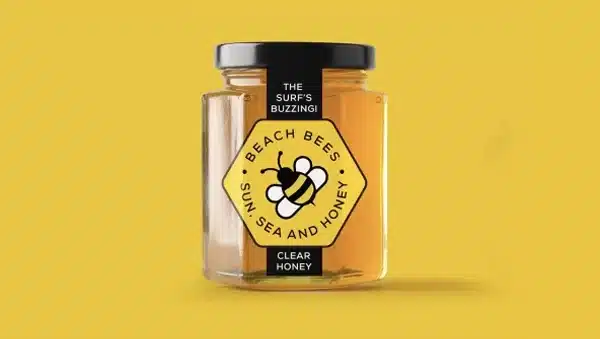
With the brand identity in place, we then developed packaging designs that would communicate the quality and purity of the honey, as well as be visually appealing and functional on store shelves. We created a packaging design that used natural materials, such as recycled paper and wood, to emphasise the natural and sustainable qualities of the honey.
We also created different packaging sizes to accommodate different needs and preferences, such as single-serve packets and larger jars. The packaging design included clear product information, such as the source of the honey, the production process, and nutritional information.
Marketing Materials:
With the brand and packaging design in place, we then developed marketing materials that would communicate the brand’s values and benefits to potential customers. We created a website that was optimised for user experience, with clear calls-to-action and persuasive messaging.
We also developed social media campaigns that targeted health-conscious consumers, using engaging content, such as recipes and health tips, to communicate the benefits of raw, unfiltered honey. We also partnered with influencers and bloggers in the health and wellness niche to promote the brand and reach a wider audience.
Results:
The new brand and packaging design was well received by customers and quickly gained a following. The packaging design stood out on store shelves, attracting the attention of health-conscious consumers. The brand received positive reviews on social media and was featured in several health and wellness publications.